GDP Components Change Over Time and Among Countries

GDP Components Change Over Time and Among Countries
Comparing Germany, Turkey, India and USA
At the risk of oversimplifying things, the main components of gross domestic product, GDP are personal consumption (C), business investment (I), government spending (G) and net exports (exports - imports).
The GDP data we will look at is from the United Nations’ National Accounts Main Aggregates Database, which contains estimates of total GDP and its components for all countries from 1970 to today. We will look at how GDP and its components have changed over time, and compare different countries and how much each component contributes to that country’s GDP. The file we will work with is GDP and its breakdown at constant 2010 prices in US Dollars and it has already been saved in the Data directory.
UN_GDP_data  <-  read_excel(here::here("data", "Download-GDPconstant-USD-countries.xls"), # Excel filename
                sheet="Download-GDPconstant-USD-countr", # Sheet name
                skip=2) # Number of rows to skip
The first thing we need to do is to tidy the data, as it is in wide format and we must make it into long, tidy format.
tidy_GDP_data  <-  UN_GDP_data %>%
  pivot_longer(cols = c(4:51), names_to = "years", values_to = "value") %>%
  filter(years >= 1970)%>%
  select(-1)%>%
  mutate(value_bn = value/(10^9))%>%
  mutate(IndicatorName = case_when(
        IndicatorName %in%  "Household consumption expenditure (including Non-profit institutions serving households)" ~ "Household expenditure",
        IndicatorName %in%  "General government final consumption expenditure" ~ "Government expenditure",
        IndicatorName %in% "Exports of goods and services" ~ "Exports",
        IndicatorName %in% "Imports of goods and services" ~ "Imports",
        IndicatorName %in% "Gross capital formation" ~ "Gross capital formation"
  ))%>%
  filter(IndicatorName %in% c("Gross capital formation",
                              "Exports",
                              "Government expenditure",
                              "Household expenditure",
                              "Imports" ))
glimpse(tidy_GDP_data)
## Rows: 52,512
## Columns: 5
## $ Country <chr> "Afghanistan", "Afghanistan", "Afghanistan", "Afghanist…
## $ IndicatorName <chr> "Household expenditure", "Household expenditure", "Hous…
## $ years <chr> "1970", "1971", "1972", "1973", "1974", "1975", "1976",…
## $ value <dbl> 5.07e+09, 4.84e+09, 4.70e+09, 5.21e+09, 5.59e+09, 5.65e…
## $ value_bn <dbl> 5.07, 4.84, 4.70, 5.21, 5.59, 5.65, 5.68, 6.15, 6.30, 6…# Let us compare GDP components for these 3 countries
country_list <- c("United States","Turkey", "Germany")First, we look at the following graph (but exchanging Turkey for India).
plot1 <- tidy_GDP_data %>%
  filter(Country %in% country_list)
plot1$IndicatorName <- factor(plot1$IndicatorName, levels =  c("Gross capital formation", "Exports", "Government expenditure", "Household expenditure", "Imports"))
ggplot(plot1, aes(x=years, y=value_bn, colour = IndicatorName))+
  geom_line(aes(group=IndicatorName))+
  scale_x_discrete(breaks = seq(1970, 2017, by = 10))+
  scale_y_continuous(breaks = seq(0, 12500, by= 2500))+
  facet_wrap(~Country)+
  labs(title = "GDP components over time",
       subtitle = "In constant 2010 USD",
       x="",
       y="Billion US$",
       colour = "Components of GDP")+
  theme_bw()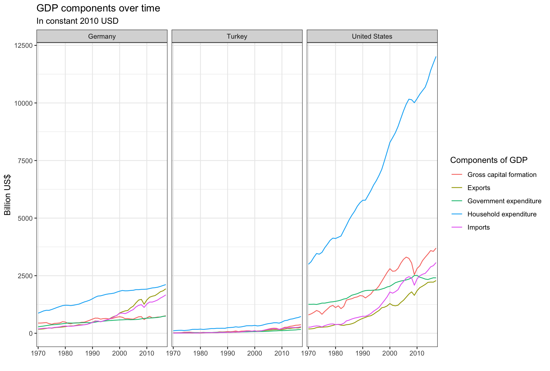
GDP is the sum of Household Expenditure (Consumption C), Gross Capital Formation (business investment I), Government Expenditure (G) and Net Exports (exports - imports). Even though there is an indicator Gross Domestic Product (GDP) in our dataframe, we calculate it by using its components discussed above.
The following graph shows the % difference between what we calculated as GDP and the GDP figure included in the dataframe:
plot2 <- plot1 %>%
group_by(Country, years)%>%
mutate(value_bn = case_when(
IndicatorName == "Imports" ~ value_bn*(-1),
IndicatorName != "Imports" ~ value_bn
))%>%
summarise("GDP_sum"=sum(value_bn))
GDP_data <- UN_GDP_data %>%
pivot_longer(cols = c(4:51), names_to = "years", values_to = "value") %>%
filter(years >= 1970)%>%
mutate(value_bn = value/(10^9))%>%
filter(IndicatorName =="Gross Domestic Product (GDP)")%>%
select(Country, years, value_bn)%>%
rename(GDP_from_data=value_bn)
comparison <- left_join(plot2, GDP_data, by = c("years" = "years", "Country"="Country"))%>%
mutate(difference = GDP_sum - GDP_from_data,
in_percent = difference/GDP_from_data)
ggplot(comparison, aes(x= years))+
#geom_line(aes(y=GDP_sum, group=1), colour = "blue")+
#geom_line(aes(y=GDP_from_data, group=1), colour = "red")+
geom_line(aes(y=in_percent, group =1))+
facet_wrap(~Country)+
scale_x_discrete(breaks = seq(1970, 2017, by = 10))+
scale_y_continuous(labels = scales::percent)+
labs(title = "Less difference occures over the years...",
subtitle = "Difference between GDP from sum and GDP from data",
x="",
y="Difference of GDP in %")+
theme_bw()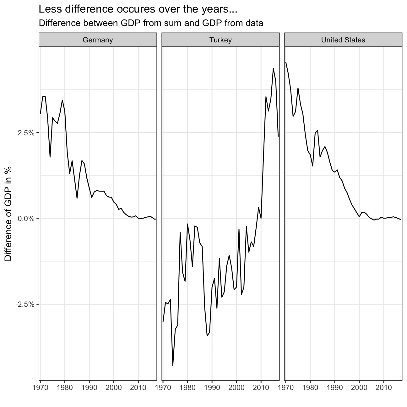 We see that the difference seems to be quite small (<5%), but a difference exists!
Now we will create the following graph:
plot1 <- tidy_GDP_data %>%
  filter(Country %in% country_list)
plot1 <- plot1 %>%
  select(Country, IndicatorName, years, value_bn)%>%
  pivot_wider(names_from = IndicatorName, values_from = value_bn)%>%
  mutate(Net_Export = Exports-Imports)%>%
  select(-6)%>%
  select(-6)
plot3 <- left_join(plot1, plot2)%>%
  pivot_longer(cols = 'Household expenditure': Net_Export, names_to = "GDP_component", values_to = "Proportion" )%>%
  mutate(Proportion = Proportion / GDP_sum)
ggplot(plot3, aes(x=years,y=Proportion, colour = GDP_component))+
  geom_line(aes(group=GDP_component))+
  facet_wrap(~Country)+
  scale_y_continuous(labels = scales::percent)+
  scale_x_discrete(breaks = seq(1970, 2017, by = 10))+
  theme_bw()+
  labs(x = "",
       y ="proportion",
       title = "GDP and its breakdown at constant 2010 prices in US Dollars",
       colour = "" ,
       caption = "Source: United Nations, http://unstats.un.org/unsd/snaama/Downloads")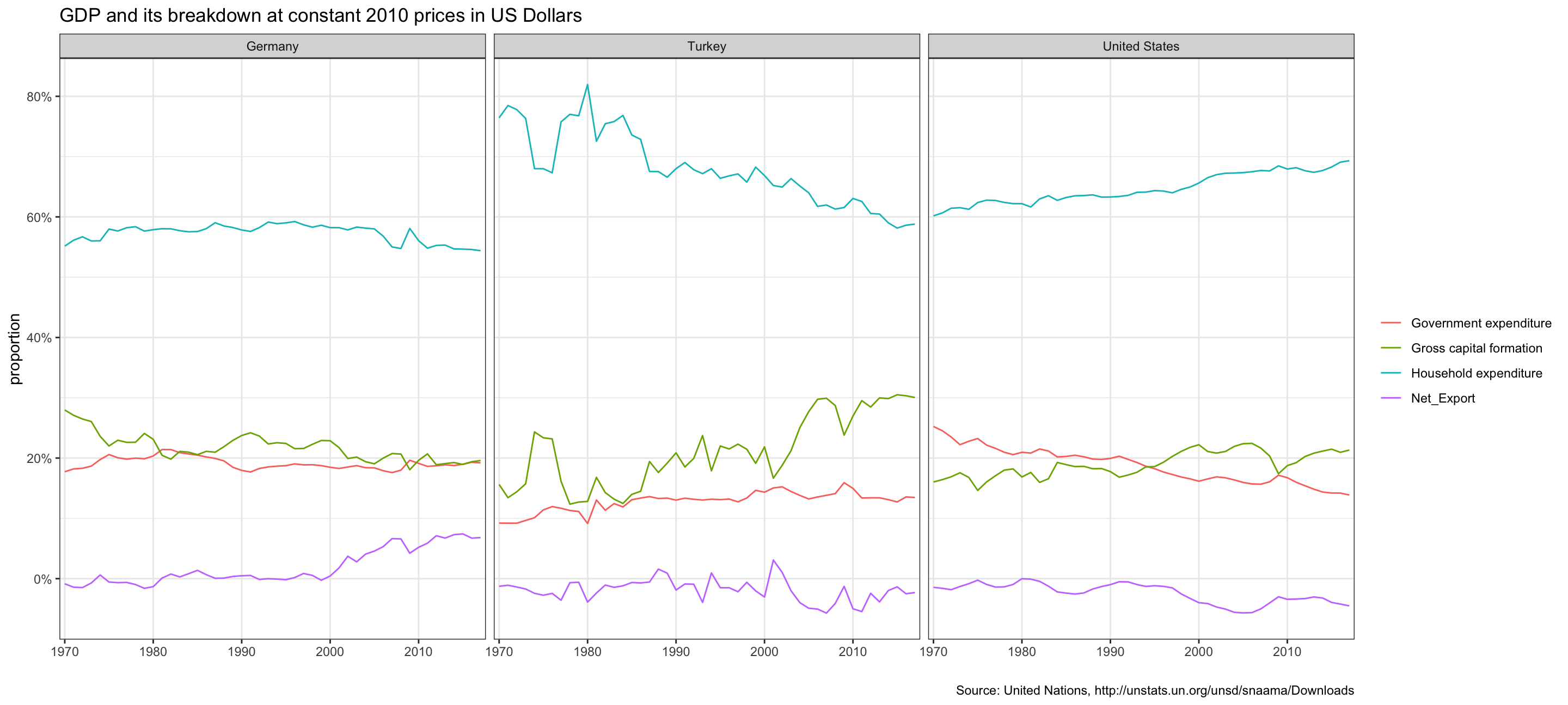
This chart tells us how the different components of the GDP (i.e. Government Expenditure, Gross capital formation, Household Expenditure and Net Exports) vary over the years as a percentage of the total GDP of Germany, India and the United States. For all countries in 2017 the biggest item for GDP is Household Expenditure, then followed by Gross capital formation, Household Expenditure and Net Exports being the smallest contribution to the national GDP. We see that Net Exports are rising for Germany between 2000 and 2017 while it stayed stable and declined slightly for India and the United States. Also Net Exports is positive for Germany while it is negative for India and the US. Rising net exports are bad for other countries because they start to owe even more money to strong-exporting nations, i.e. Germany. Government Expenditures were stable for Germany and India, however declined strongly for the US. Gross capital formation declines for Germany, stays about the same for the US and increases strongly in the 2000s and 2010s for India. This can be explained by the Solow-Model: As Germany and the US are developed countries they are already closer to the “Steady State” and grow their capital at a smaller rate than for example India, which is farer away from their steady state. Household Expenditure declines slightly in percentage for Germany, declines strongly for India and grows for the US.