An Analysis on London Bike Sharing
An Analysis on London Bike Sharing
Explaining excess rentals in TFL
url <- "https://data.london.gov.uk/download/number-bicycle-hires/ac29363e-e0cb-47cc-a97a-e216d900a6b0/tfl-daily-cycle-hires.xlsx"
# Download TFL data to temporary file
httr::GET(url, write_disk(bike.temp <- tempfile(fileext = ".xlsx")))
## Response [https://airdrive-secure.s3-eu-west-1.amazonaws.com/london/dataset/number-bicycle-hires/2020-09-18T09%3A06%3A54/tfl-daily-cycle-hires.xlsx?X-Amz-Algorithm=AWS4-HMAC-SHA256&X-Amz-Credential=AKIAJJDIMAIVZJDICKHA%2F20201020%2Feu-west-1%2Fs3%2Faws4_request&X-Amz-Date=20201020T023817Z&X-Amz-Expires=300&X-Amz-Signature=857f240663fa9560cf0e3fb11ade96c3d9679d94a7637ddcaebcb2a92c4c3fed&X-Amz-SignedHeaders=host]
## Date: 2020-10-20 02:39
## Status: 200
## Content-Type: application/vnd.openxmlformats-officedocument.spreadsheetml.sheet
## Size: 165 kB
## <ON DISK> /var/folders/j5/wh9t763d73732_b5vvq80rph0000gn/T//RtmpS4KSHY/file262f3be021ce.xlsx# Use read_excel to read it as dataframe
bike0 <- read_excel(bike.temp,
sheet = "Data",
range = cell_cols("A:B"))
# change dates to get year, month, and week
bike <- bike0 %>%
clean_names() %>%
rename (bikes_hired = number_of_bicycle_hires) %>%
mutate (year = year(day),
month = lubridate::month(day, label = TRUE),
week = isoweek(day))We can easily create a facet grid that plots bikes hired by month and year.
For May and Jun 2020 we observe that the curves are more flat compared to the previous years. This can be explained by Covid. Also it shows that bike rentals in May and June 2020 are distributed evenly between 20k and 60k, while in the previous years you always have a peak that shows that in the previous years we had for each month a certain number for daily rentals that didn’t differ that much by day.
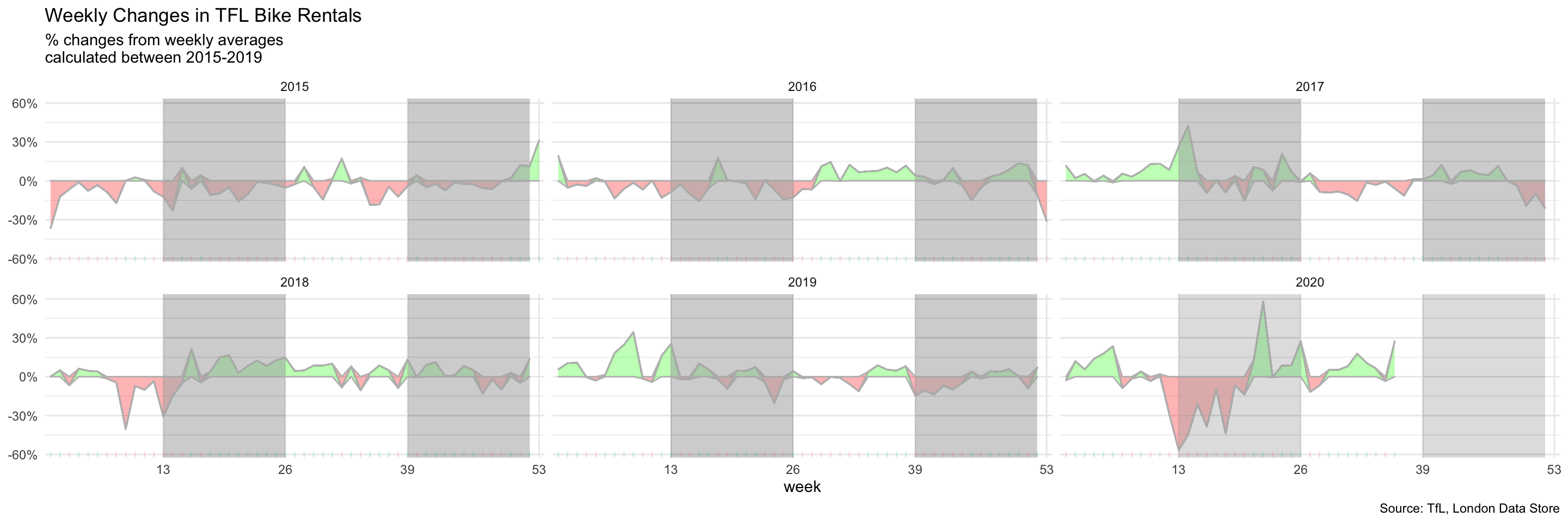
The second one looks at percentage changes from the expected level of weekly rentals. The two grey shaded rectangles correspond to the second (weeks 14-26) and fourth (weeks 40-52) quarters.
Plot the first Graph, where the blue line is the expected number of rentals in that month, and the black line is actual number of rentals. The difference is shaded red, if number of excess rentals is smaller than 0, and green otherwise.
bikes_monthly$month <- as.factor(bikes_monthly$month)
ggplot(data=bikes_monthly, aes(x=month , y=expected_rentals, group=1)) + facet_wrap(~year) +
labs(x=NULL, y="Bike Rentals\n", caption="Source: TfL, London Data Store", title="Monthly changes in TfL bike rentals", subtitle= "Change from monthly average shown in blue \nand calculated between 2015-2019") + theme_minimal(base_family="Arial") +
  theme (plot.title = element_text(size=13, face="bold"), plot.subtitle = element_text(size=9))+
  geom_ribbon(aes(ymin = expected_rentals + if_else(excess_rentals < 0, excess_rentals, 0),
                  ymax = expected_rentals), color ="grey", fill = "red", alpha = 0.3) +
  geom_ribbon(aes(ymin = expected_rentals,
                  ymax = expected_rentals + if_else(excess_rentals > 0, excess_rentals, 0)),color ="grey", fill = "green", alpha = 0.3)+ theme(aspect.ratio=0.5) + theme(axis.text.x= element_text(size=5)) +
  scale_x_discrete(labels=c("Jan", "Feb", "Mar", "Apr", "May", "Jun", "Jul", "Aug", "Sep", "Oct", "Nov", "Dec"))+ geom_line(color="blue")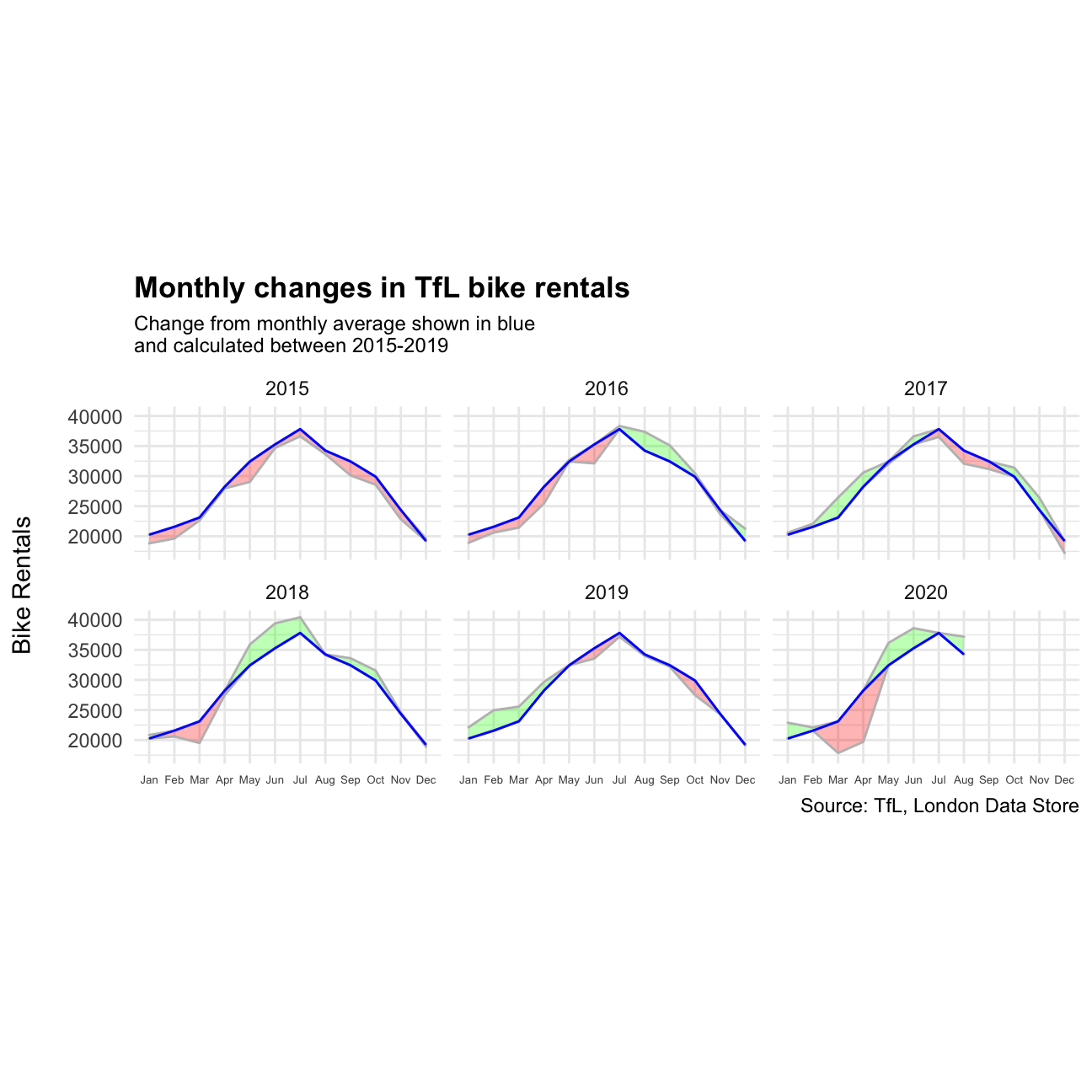
bike_filtered_week <- bike %>%
                  filter(year %in% c(2015: 2020)) %>%
                  group_by(year, week) %>%
                  summarise(avgWeek_filtered_week=mean(bikes_hired))
#Calculate expected number of rentals each week
bike_weekly_average <- bike_filtered_week %>%
                  filter(year %in% c(2015: 2019)) %>%
                  group_by(week) %>%
                  summarise(avgWeek_weekly_average=mean(avgWeek_filtered_week))
#Merge data
bike_joined_full <- left_join(bike_filtered_week, bike_weekly_average, by = "week")
#Calculate the percentage excess rental on each week of the year
bike_joined_full_2 <- bike_joined_full %>%
  mutate(above_avg = (avgWeek_filtered_week - avgWeek_weekly_average)*100/avgWeek_weekly_average)
ggplot(bike_joined_full_2, aes(x=week, y=above_avg)) +
labs(title= "Weekly Changes in TFL Bike Rentals", subtitle="% changes from weekly averages \ncalculated between 2015-2019", x="week", y=NULL, caption="Source: TfL, London Data Store") +
geom_line(fill="black") +
theme_minimal() +
facet_wrap(~year)+
geom_ribbon(aes(ymin = above_avg - if_else(above_avg < 0, above_avg, 0),
ymax = above_avg), color ="grey", fill = "red", alpha = 0.3) +
geom_ribbon(aes(ymin = above_avg,
ymax = above_avg - if_else(above_avg > 0, above_avg, 0)),color ="grey", fill = "green", alpha = 0.3) +
scale_x_discrete(limits = c(13, 26, 39, 53)) +
#Shape for quartiles of the year
geom_rect(xmin=13, xmax=26, ymin=-150, ymax=150, fill="grey", alpha=0.01) +
geom_rect(xmin=39, xmax=52,ymin=-150, ymax=150, fill="grey", alpha=0.01) +
geom_rug(sides="b", aes(colour=ifelse(above_avg > 0, "red", "green")), alpha=0.2) +
theme(legend.position='none') +
scale_y_continuous(labels = function(x) paste0(x, "%"))