Yield Curve Inversion Analysis

Yield Curve Inversion Analysis
Is it really an indicator of recession?
Every so often, we hear warnings from commentators on the “inverted yield curve” and its predictive power with respect to recessions. An explainer what a inverted yield curve is can be found here. If you’d rather listen to something, here is a great podcast from NPR on yield curve indicators
In addition, many articles and commentators think that, e.g., Yield curve inversion is viewed as a harbinger of recession. One can always doubt whether inversions are truly a harbinger of recessions, and use the attached parable on yield curve inversions.
In our case we will look at US data and use the FRED database to download historical yield curve rates, and plot the yield curves since 1999 to see when the yield curves flatten.
First, we will use the tidyquant package to download monthly rates for different durations.
# Get a list of FRED codes for US rates and US yield curve; choose monthly frequency
# to see, eg., the 3-month T-bill https://fred.stlouisfed.org/series/TB3MS
tickers <- c('TB3MS', # 3-month Treasury bill (or T-bill)
             'TB6MS', # 6-month
             'GS1',   # 1-year
             'GS2',   # 2-year, etc....
             'GS3',
             'GS5',
             'GS7',
             'GS10',
             'GS20',
             'GS30')  #.... all the way to the 30-year rate
# Turn  FRED codes to human readable variables
myvars <- c('3-Month Treasury Bill',
            '6-Month Treasury Bill',
            '1-Year Treasury Rate',
            '2-Year Treasury Rate',
            '3-Year Treasury Rate',
            '5-Year Treasury Rate',
            '7-Year Treasury Rate',
            '10-Year Treasury Rate',
            '20-Year Treasury Rate',
            '30-Year Treasury Rate')
maturity <- c('3m', '6m', '1y', '2y','3y','5y','7y','10y','20y','30y')
# by default R will sort these maturities alphabetically; but since we want
# to keep them in that exact order, we recast maturity as a factor
# or categorical variable, with the levels defined as we want
maturity <- factor(maturity, levels = maturity)
# Create a lookup dataset
mylookup<-data.frame(symbol=tickers,var=myvars, maturity=maturity)
# Take a look:
mylookup %>%
knitr::kable()| symbol | var | maturity |
|---|---|---|
| TB3MS | 3-Month Treasury Bill | 3m |
| TB6MS | 6-Month Treasury Bill | 6m |
| GS1 | 1-Year Treasury Rate | 1y |
| GS2 | 2-Year Treasury Rate | 2y |
| GS3 | 3-Year Treasury Rate | 3y |
| GS5 | 5-Year Treasury Rate | 5y |
| GS7 | 7-Year Treasury Rate | 7y |
| GS10 | 10-Year Treasury Rate | 10y |
| GS20 | 20-Year Treasury Rate | 20y |
| GS30 | 30-Year Treasury Rate | 30y |
df <- tickers %>% tidyquant::tq_get(get="economic.data",
                   from="1960-01-01")   # start from January 1960
glimpse(df)
## Rows: 6,774
## Columns: 3
## $ symbol <chr> "TB3MS", "TB3MS", "TB3MS", "TB3MS", "TB3MS", "TB3MS", "TB3MS",…
## $ date <date> 1960-01-01, 1960-02-01, 1960-03-01, 1960-04-01, 1960-05-01, 1…
## $ price <dbl> 4.35, 3.96, 3.31, 3.23, 3.29, 2.46, 2.30, 2.30, 2.48, 2.30, 2.…Our dataframe df has three columns (variables):
symbol: the FRED database ticker symboldate: already a date objectprice: the actual yield on that date
The first thing would be to join this dataframe df with the dataframe mylookup so we have a more readable version of maturities, durations, etc.
yield_curve <-left_join(df,mylookup,by="symbol") Plotting the yield curve
We want to create a graph for following periods
Yields on US rates by duration since 1960
yield_curve$var <- factor(yield_curve$var, levels =myvars)
ggplot(yield_curve, aes(x=date, y=price, colour = var))+
  geom_line(show.legend = FALSE, group=1)+
  facet_wrap(~var, ncol = 2)+
  theme_bw()+
  labs(title = "Yields on U.S. Treasury rates since 1960",
       caption = "Source: St. Louis Federal Reserve Economic Database (FRED)",
       x="",
       y="%")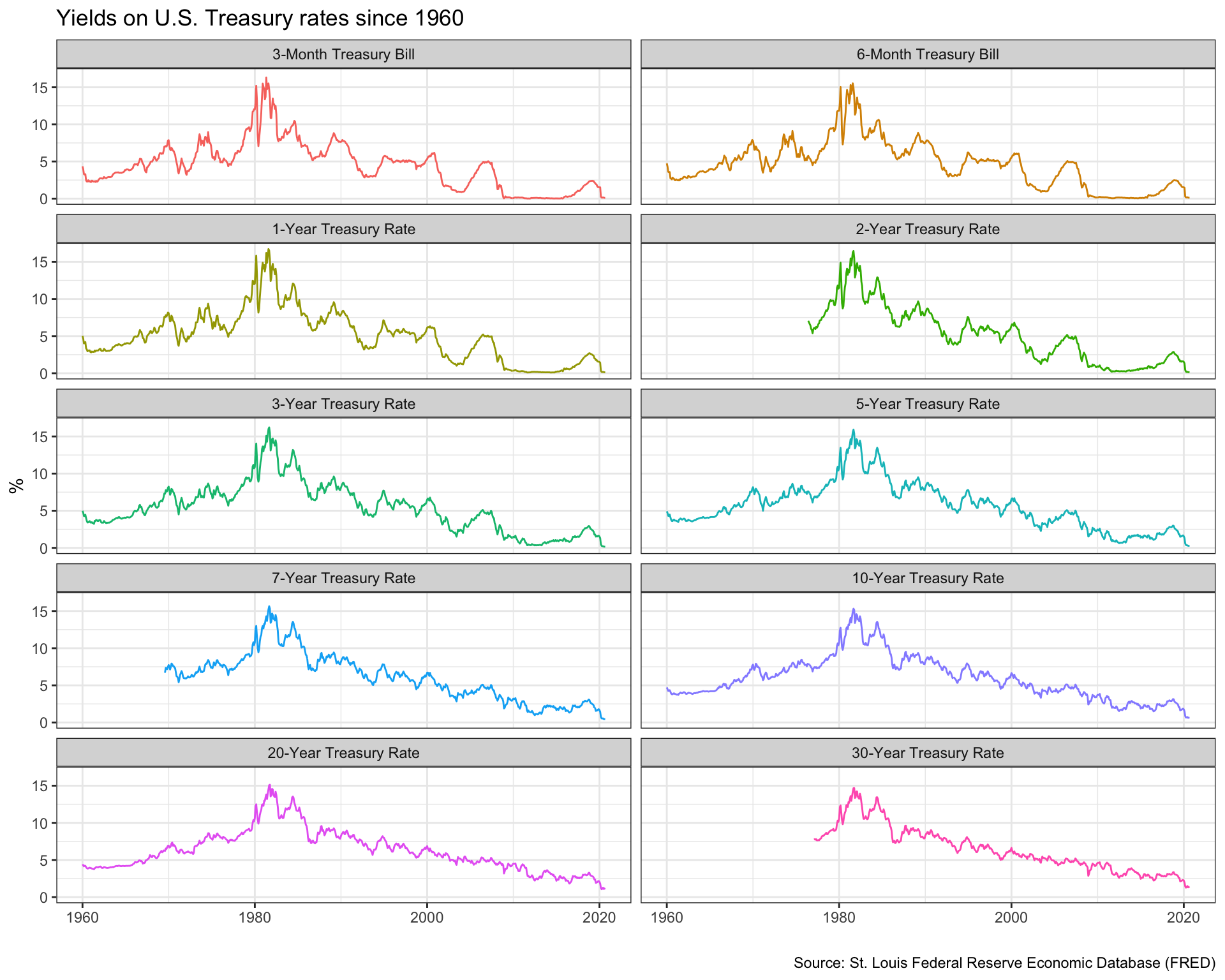
Monthly yields on US rates by duration since 1999 on a year-by-year basis
library(lubridate)
plot2 <- yield_curve%>%
  mutate(year = year(date),
         month = month(date))%>%
filter(year >= 1999)
ggplot(plot2, aes(x=maturity,
                  y=price,
                  colour=year,
                  group=date))+
  geom_line(show.legend = FALSE)+
  facet_wrap(~year, ncol = 4)+
  theme_bw()+
  labs(title= "US Yield Curve",
       caption = "Source: St. Loius Federal Reserve Economic Database (FRED)",
       x= "Maturity",
       y= "Yield (%)")+
  scale_color_gradientn(colours = rainbow(30))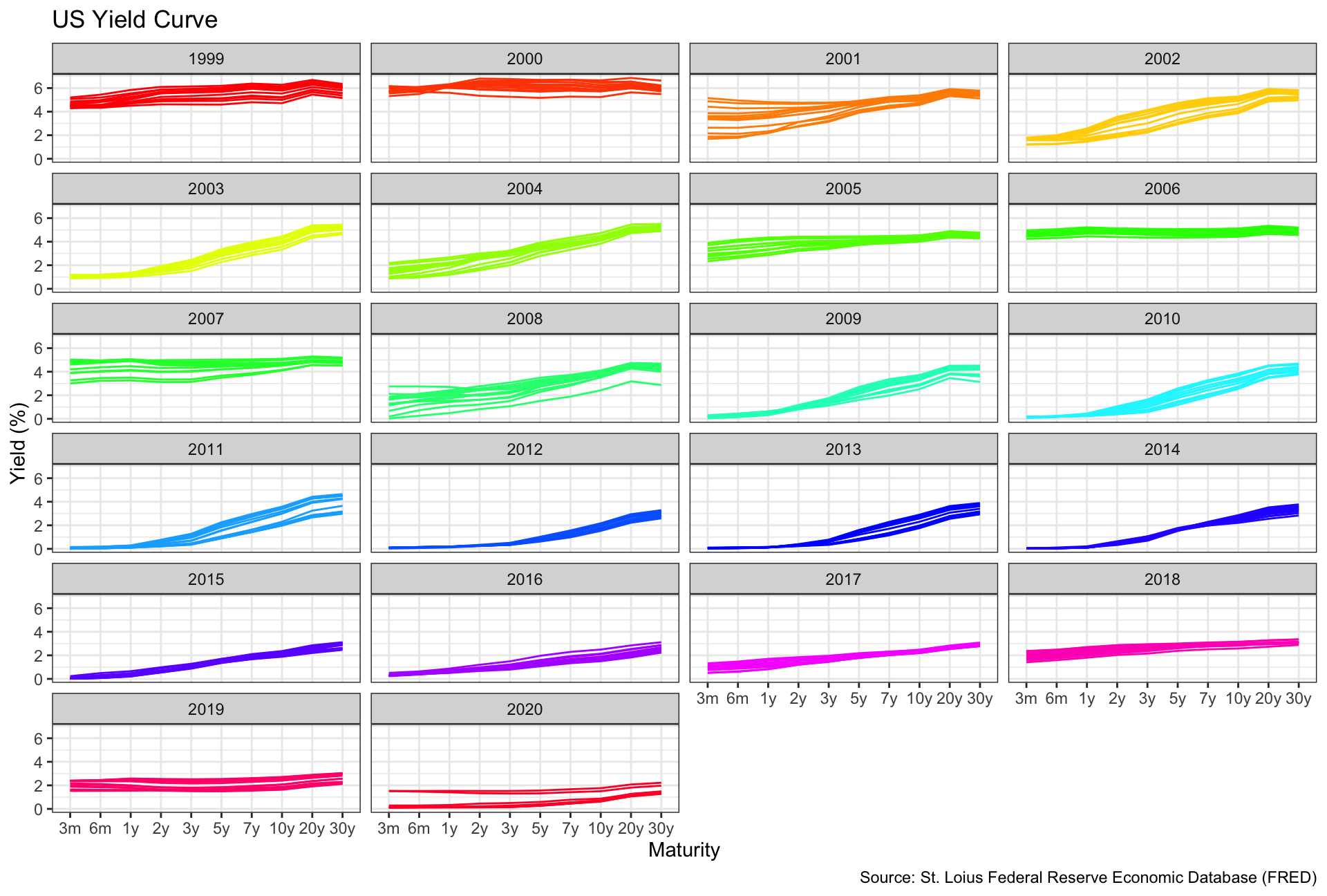
3-month and 10-year yields since 1999
plot3 <- plot2%>%
  filter(maturity %in% c("3m", "10y"))
ggplot(plot3, aes(x=date, y=price, colour= var))+
  geom_line()+
  theme_bw()+
  theme(legend.title = element_blank())+
  labs(title = "Yields on 3-month and 10-year US Treasury rates since 1999",
       caption = "Source: St. Louis Federal Reserve Economic Database (FRED)",
       x="",
       y="%")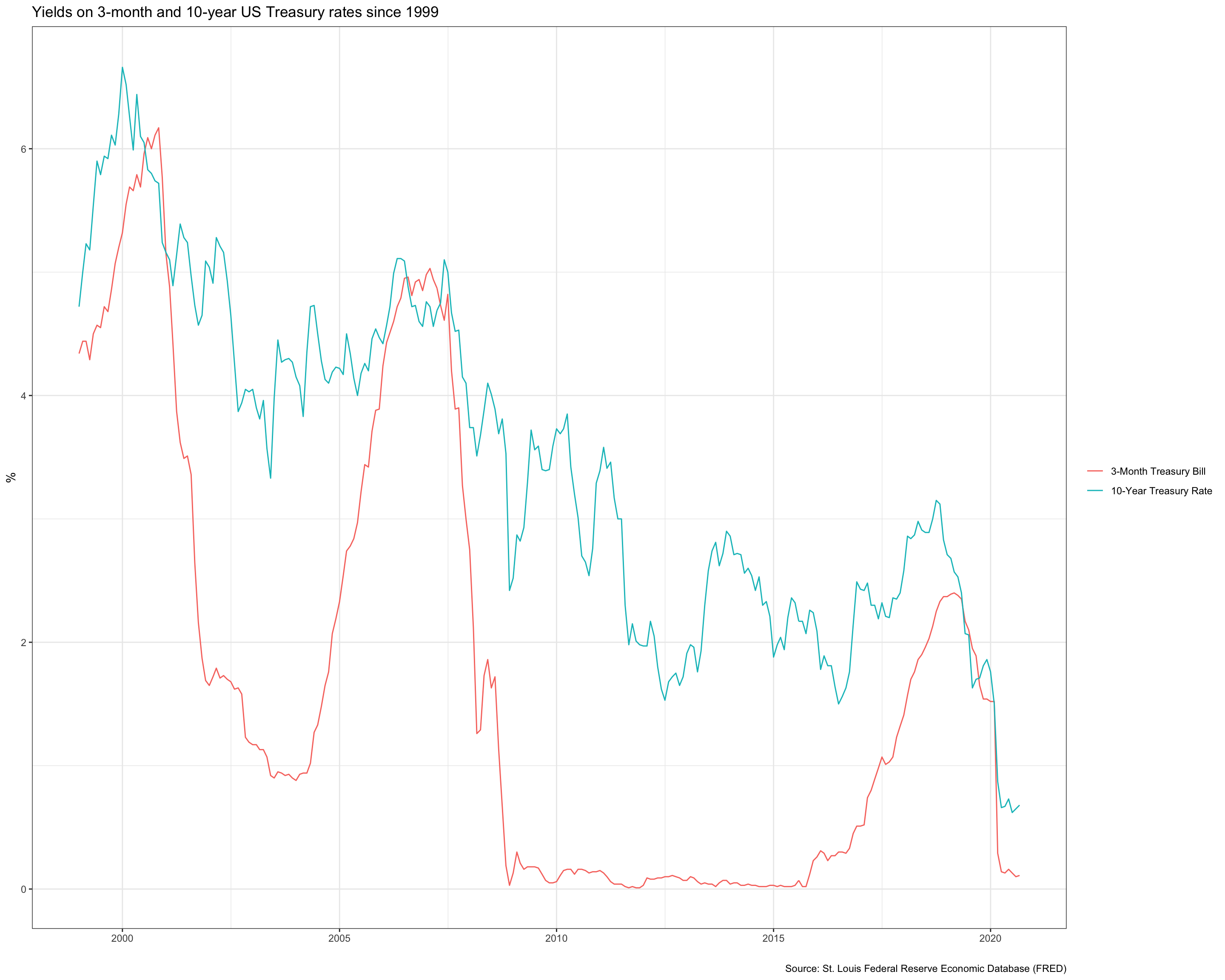
To plot our final graph we will
- Setup data for US recessions
- Superimpose recessions as the grey areas in our plot
- Plot the spread between 30 years and 3 months as a blue/red ribbon, based on whether the spread is positive (blue) or negative(red)
- For the first, the code below creates a dataframe with all US recessions since 1946
# get US recession dates after 1946 from Wikipedia
# https://en.wikipedia.org/wiki/List_of_recessions_in_the_United_States
recessions <- tibble(
  from = c("1948-11-01", "1953-07-01", "1957-08-01", "1960-04-01", "1969-12-01", "1973-11-01", "1980-01-01","1981-07-01", "1990-07-01", "2001-03-01", "2007-12-01"),
  to = c("1949-10-01", "1954-05-01", "1958-04-01", "1961-02-01", "1970-11-01", "1975-03-01", "1980-07-01", "1982-11-01", "1991-03-01", "2001-11-01", "2009-06-01")
  )  %>%
  mutate(From = ymd(from),
         To=ymd(to),
         duration_days = To-From)
recessions <- recessions%>%
  filter(year(from) >=1960)
Then we continue to plot the graph:
plot4 <- yield_curve%>%
select(date, symbol, price)%>%
pivot_wider(names_from = symbol, values_from = price)%>%
mutate(diff = GS10 - TB3MS)
ggplot(plot4, aes(x=date, y=diff))+
geom_line()+
geom_hline(aes(yintercept=0),color="black")+
geom_ribbon(aes(ymin=0,ymax=ifelse(diff>0, diff,0)),fill="blue",alpha=0.2)+
geom_ribbon(aes(ymin=ifelse(diff<0, diff,0),ymax=0),fill="red",alpha=0.2) +
geom_rect(data=recessions,
inherit.aes = FALSE,
aes(ymin=-Inf,
ymax= Inf,
xmin=From,
xmax=To),
fill = "black",
alpha = 0.2)+
theme_bw()+
scale_x_date(date_breaks="2 years",date_labels="%Y")+
labs(title = "Yield Curve Inversion: 10-year minus3-month U.S. Treasury rates",
subtitle = "Difference in % points, monthly averages.\nShaded areas correspond to recessions",
caption = "Source: St. Louis Federal Reserve Economic Database (FRED)",
x="",
y="Difference (10 year-3 month) yield in %")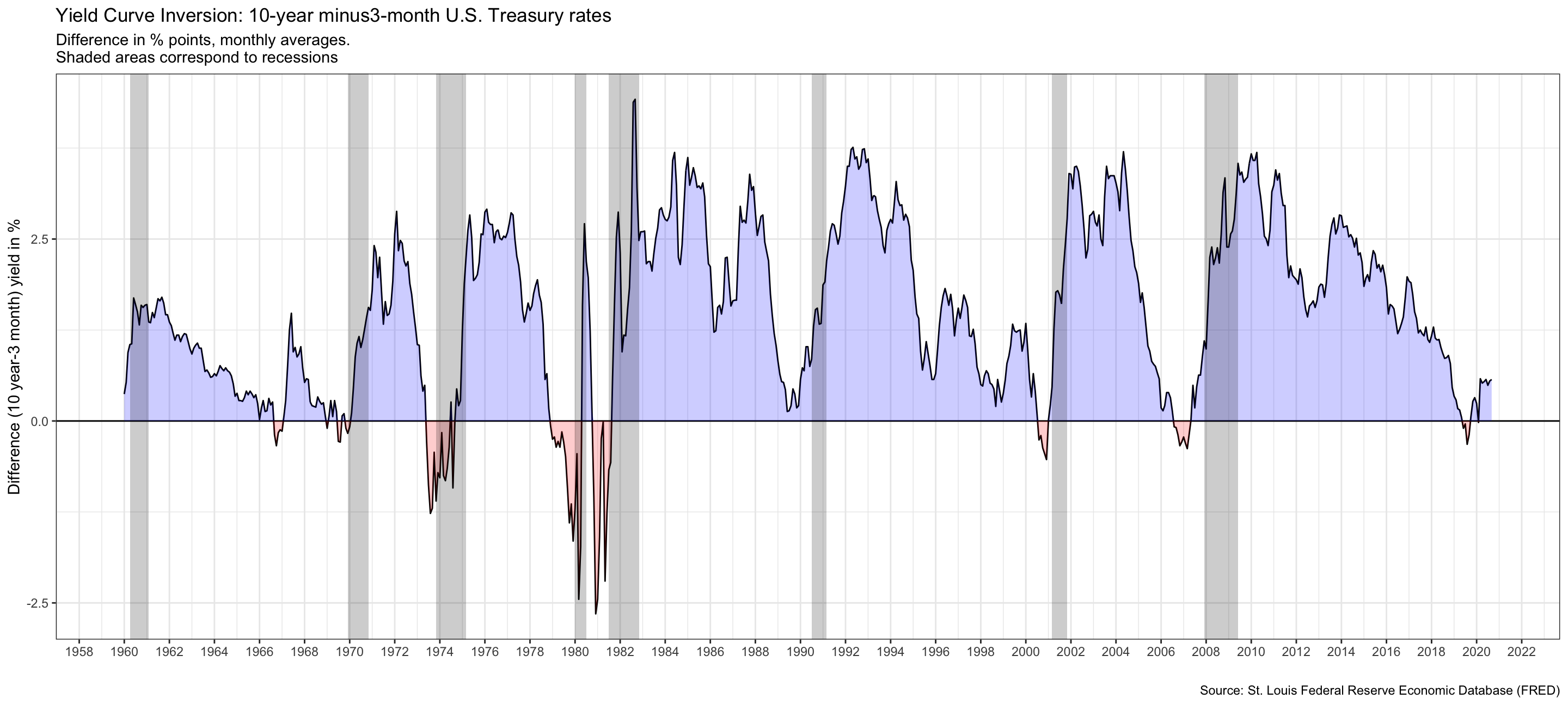 This graph shows us that the yield curve actually flattens before recessions. Therefore, a flatten of the yield curve can predict an upcoming recession.
Furthermore, since 1999 the 3-month yield has more than a 10-year for three times:
- 2000- 2006- 2007
This graph shows us that the yield curve actually flattens before recessions. Therefore, a flatten of the yield curve can predict an upcoming recession.
Furthermore, since 1999 the 3-month yield has more than a 10-year for three times:
- 2000- 2006- 2007